

Showing posts with label Branding. Show all posts
Showing posts with label Branding. Show all posts
Wednesday, January 16, 2013
Freelance - Gemini Business Card
I was commissioned to design a business card for a new cleaning company. The client had a logo, and a specific idea of how they wanted the card to look, which I followed, but I also suggested some alterations which they were very pleased with. The outcome can be seen below.


Thursday, November 15, 2012
Visconti Rebrand
I have recently been working on a little brief I set myself, to rebrand Visconti, an Italian pen company. The pens are traditionally made, of high quality, and therefor require an company image which maintains their desirability.
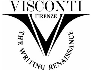

My Design
I do like their current logo, however I feel it is a tad dated, and just not quite put together effectively. I decided to keep to icon of the V because it works very well when applied to the nibs, ink bottles etc, and will be recognisable. To give Visconti a slightly more modern feel I gave the logo a more rounded shape, whilst keeping the top of the V squared to mimic the typeface underneath. The V contains the shape of a typical nib, and also the smoothness and transition from the thick and thin writing of a calligraphy pen. These things bring in different elements to the design.
With the type, I didn't feel the logo needed too much of a change from what was already designed, so I chose a serif typeface which is clear, with a nice rounded C and O. I chose not to include the 'Firenze' that was in the current logo because I wanted to strip it back and not to over clutter or bulk up the logo unnecessarily.
Testing out the logo on Visconti products I think it looks good. Clear and classy.

More applications are to follow.
This is my logo design, set as a personal project for myself, and is not commissioned or associated with the company.
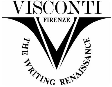
Current Logo

My Design
I do like their current logo, however I feel it is a tad dated, and just not quite put together effectively. I decided to keep to icon of the V because it works very well when applied to the nibs, ink bottles etc, and will be recognisable. To give Visconti a slightly more modern feel I gave the logo a more rounded shape, whilst keeping the top of the V squared to mimic the typeface underneath. The V contains the shape of a typical nib, and also the smoothness and transition from the thick and thin writing of a calligraphy pen. These things bring in different elements to the design.
With the type, I didn't feel the logo needed too much of a change from what was already designed, so I chose a serif typeface which is clear, with a nice rounded C and O. I chose not to include the 'Firenze' that was in the current logo because I wanted to strip it back and not to over clutter or bulk up the logo unnecessarily.
Testing out the logo on Visconti products I think it looks good. Clear and classy.

More applications are to follow.
This is my logo design, set as a personal project for myself, and is not commissioned or associated with the company.
Wednesday, August 31, 2011
Crescent Chocolate Packaging


Crescent is a luxury new dark chocolate collection from Nestle. I took the moon as a concept and showed it throughout the whole design. The box is covered in varnish constellations, a silver foil logo, and inside is a menu card where the lighter the chocolate, the fuller the moon.
Tuesday, August 16, 2011
Reveal 2011 Branding

I was chosen as one of 4 people to brand the Northumbria University design degree show, Reveal 2011 and the Stuff symposium. it was a big task as we had control over almost everything, including invites, maps, directions, wall vinyls, flags and more.
Each course in the design school starts a brief with an idea, and that is what our concept was. We wanted to show how that idea progresses and evolves.
We chose vibrant citrus colours to brighten up the white walls of the building. All the material for Reveal was green and all Stuff symposium material was orange. This made it easier to distinguish between the two events.


The directional vinyls were placed around the building showing clearly where each course was exhibiting, the toilets, stairs and lifts, and also the no entry areas. A flyer was also created for containing this information.
A video was also created and can be viewed here.
Stuff Symposium Branding
The Stuff symposium was related to the Reveal 2011 branding I worked on. The invites were following the same design as the Reveal ones, but were a bright orange colour instead or green.

 A conference desk was designed for people to sign in and to get more information, and to collect the schedule of debates.


Tuesday, May 03, 2011
Set Slice Branding


Set Slice is a typographically themed restaurant based on the Typographer Justus Erich Walbaum. Walbaum was a pastry chef before becoming a professional typographer, and I wanted to celebrate this by creating a German style Konditorei (bakery).
Friday, April 01, 2011
D&AD Body Shop Entry
Finally after a lot of hard work, my group and I submitted our D&AD entry for The Body Shop brief. These boards show our concept, development, and two boards showing the solution. It was important to us that we got a solid concept before we started designing the packaging, as we wanted our solution to mean more than just looking appealing.
We designed fruit stickers to show each products main natural ingredient and its origin, and then applied it to the paper wrapping as thought it was a fresh product. This allowed for a environmentally sound design while representing the natural goodness of The Body Shop. A company whose values and products are quite literally 'Good All Over'.


Subscribe to:
Posts (Atom)