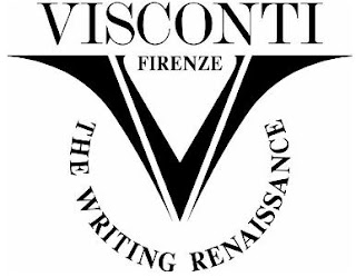
Current Logo
My Design
I do like their current logo, however I feel it is a tad dated, and just not quite put together effectively. I decided to keep to icon of the V because it works very well when applied to the nibs, ink bottles etc, and will be recognisable. To give Visconti a slightly more modern feel I gave the logo a more rounded shape, whilst keeping the top of the V squared to mimic the typeface underneath. The V contains the shape of a typical nib, and also the smoothness and transition from the thick and thin writing of a calligraphy pen. These things bring in different elements to the design.
With the type, I didn't feel the logo needed too much of a change from what was already designed, so I chose a serif typeface which is clear, with a nice rounded C and O. I chose not to include the 'Firenze' that was in the current logo because I wanted to strip it back and not to over clutter or bulk up the logo unnecessarily.
Testing out the logo on Visconti products I think it looks good. Clear and classy.
More applications are to follow.
This is my logo design, set as a personal project for myself, and is not commissioned or associated with the company.


Loving this soph! Yours looks so much better! =)
ReplyDelete