Showing posts with label Typography. Show all posts

Thursday, November 15, 2012

Visconti Rebrand

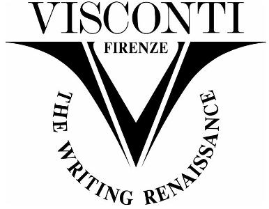
I have recently been working on a little brief I set myself, to rebrand Visconti, an Italian pen company. The pens are traditionally made, of high quality, and therefor require an company image which maintains their desirability.


Current Logo


                                                               My Design


I do like their current logo, however I feel it is a tad dated, and just not quite put together effectively. I decided to keep to icon of the V because it works very well when applied to the nibs, ink bottles etc, and will be recognisable. To give Visconti a slightly more modern feel I gave the logo a more rounded shape, whilst keeping the top of the V squared to mimic the typeface underneath. The V contains the shape of a typical nib, and also the smoothness and transition from the thick and thin writing of a calligraphy pen. These things bring in different elements to the design.

With the type, I didn't feel the logo needed too much of a change from what was already designed, so I chose a serif typeface which is clear, with a nice rounded C and O. I chose not to include the 'Firenze' that was in the current logo because I wanted to strip it back and not to over clutter or bulk up the logo unnecessarily.

Testing out the logo on Visconti products I think it looks good. Clear and classy.


More applications are to follow.


This is my logo design, set as a personal project for myself, and is not commissioned or associated with the company.

Sunday, May 20, 2012

Floral Flower Display Letters and Numbers

I've had a busy few weeks but managed to create a set of floral letters suitable for summer, spring, classroom or bedroom displays, labels etc.


Sunday, April 15, 2012

Early Learning HQ - Work Experience

Last week I started to create work for Early Learning HQ. It is a website where parents and teachers can download resources for children, for free. There is a range of material on the site, with games, letters, literacy, numeracy, songs and stories.

I have started off creating different themed letters and numbers using  Sassoon Primary Infant, the specified typeface, and am going to progress on to mazes, stickers and labels.

Below is a few examples of the pdf's I've created so far.


Thursday, January 26, 2012

Motivational Team Tea Posters

I've been really busy recently, but managed to create a couple of quick motivational posters. The general idea is that a team is made up of many individuals, and in workplaces, these individuals have a certain cup that they drink from. A cup can say a lot about you, whether it's a present from a special person, or a free cup received with promotional material from a company you haven't even heard of, each has a story. A team doesn't work without variety, different views, opinions, and ideas.

I like tea with 1 sugar, or if I'm thirsty, green tea with mint.

Wednesday, August 31, 2011

Crescent Chocolate Packaging


Crescent is a luxury new dark chocolate collection from Nestle. I took the moon as a concept and showed it throughout the whole design. The box is covered in varnish constellations, a silver foil logo, and inside is a menu card where the lighter the chocolate, the fuller the moon.

Tuesday, May 03, 2011

Set Slice Branding


Set Slice is a typographically themed restaurant based on the Typographer Justus Erich Walbaum. Walbaum was a pastry chef before becoming a professional typographer, and I wanted to celebrate this by creating a German style Konditorei (bakery).

Monday, November 15, 2010

Nottingham Poster

After walking around Nottingham, I designed a double sided poster documenting my journey. The front shows street names and the size shows the number of times I walked along them. The back of the poster is a series of photographs where I found circles around the city